Graphs and charts are important ways to visualize data. They provide people with a way to interpret and make sense of data at a quick glance without having to make calculations.
A variety of people use graphs and charts to communicate information. Journalists use graphs to visually portray economic data, civic data, demographic data, and other important statistics. Advertisers also use graphs to convince people to spend money on a particular cause or product.
However, graphs and charts can sometimes be misleading. A community newspaper featured the article shown below in a recent edition.
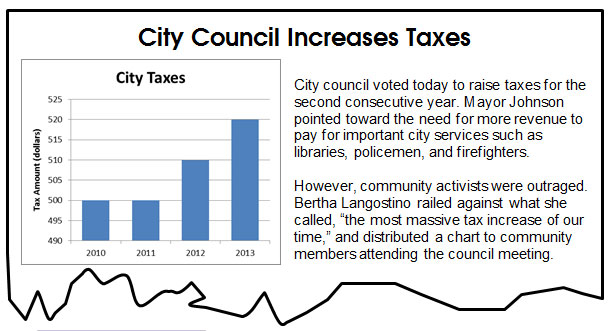
Compare the bar representing the city taxes for 2011 to the bar representing the city taxes for 2013. At first glance, it seems like the 2013 city taxes are substantially higher than the 2011 city taxes.
Take a closer look at the graph appearing in the newspaper article. The actual dollar increase from 2011 city taxes to 2013 city taxes is $20. This may or may not be a significant increase in city taxes.
In this lesson, you will investigate different ways that graphs can cause people to make invalid conclusions. You will also study ways to become more savvy consumers of data and analyze whether a given conclusion is supported by data presented in a graph or a table.
 Each year, actors, actresses, directors, producers, and many other talented individuals are nominated for the Academy of Motion Picture Arts and Sciences' Academy Awards, which are also called the Oscars. The table below shows five recent years and the movies each year that received the greatest number of nominations.
 The population of Texas for recent years, according to the U.S. Census Bureau, is shown in the table.