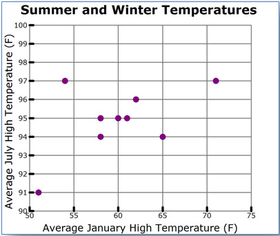
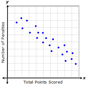
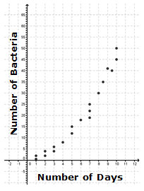
In the last section, you used scatterplots to distinguish between linear associations and non-linear associations. In this section, you will use scatterplots to distinguish between positive linear associations and negative linear associations. In a linear association, data will appear to be clustered around a trend line. Data are said to be clustered when the data values seem to be gathered around a particular value.
Describing Characteristics of Positive Trends
In this section, you will practice creating a scatterplot, and then use that scatterplot to analyze a relationship that exhibits a positive trend.
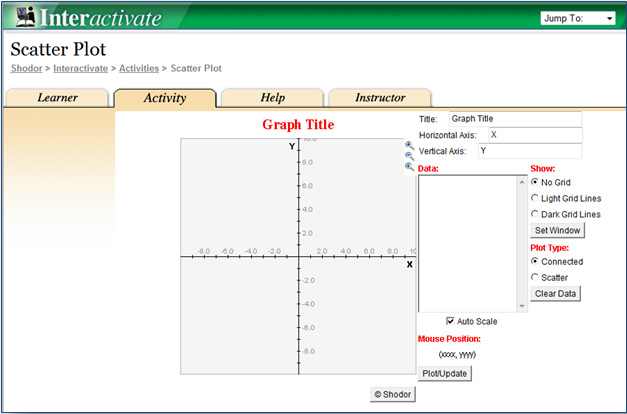
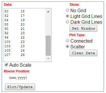
Use The ScatterPlot grapher by clicking the image below.
Click for additional directions on how to use the grapher.
- The table below contains data collected twice each month regarding the number of jars of peach preserves sold at a general store in Fredericksburg, Texas, and the number of songs that are downloaded in New York City.
| Semi-Monthly Data Collection |
|
Week
|
Number of Jars of Peach Preserves Sold in Fredericksburg, Texas
|
Songs Downloaded in New York City (thousands)
|
|
January 1
|
8
|
16
|
|
January 15
|
15
|
35
|
|
February 1
|
17
|
32
|
|
February 15
|
11
|
28
|
|
March 1
|
19
|
40
|
|
March 15
|
25
|
55
|
|
April 1
|
30
|
60
|
|
April 15
|
31
|
70
|
|
May 1
|
33
|
75
|
|
May 15
|
37
|
80
|
|
June 1
|
35
|
72
|
|
June 15
|
32
|
76
|
|
July 1
|
28
|
55
|
|
July 15
|
15
|
33
|
|
August 1
|
22
|
50
|
|
August 15
|
24
|
50
|
|
September 1
|
28
|
58
|
|
September 15
|
17
|
40
|
|
October 1
|
16
|
36
|
|
October 15
|
8
|
20
|
|
November 1
|
13
|
31
|
|
November 15
|
17
|
35
|
|
December 1
|
11
|
20
|
|
December 15
|
15
|
37
|
Click here to open table in a new tab.
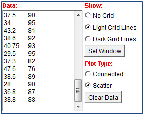
Copy the data from the Number of Jars of Peach Preserves column and Songs Downloaded column. Paste the data into the Data box of the grapher.
2. In the grapher, use the radio buttons to show the Light Grid Lines and change the plot type to Scatter.
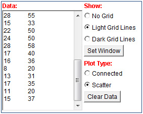
3. Click the Plot/Update button to generate a scatterplot. Use the scatterplot to answer the questions below.
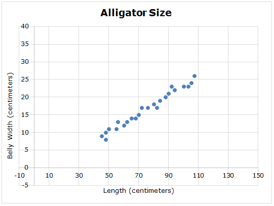
See a sample graph.
4. Do the data points appear to follow a linear association? How can you tell?
5. As you read the graph from left to right, do the points seem to move upward or downward?
6. As the number of jars of peach preserves sold in Fredericksburg, Texas increases, what happens to the number of songs downloaded in New York City?
7. If a greater number of jars of peach preserves are sold in Fredericksburg, what can you predict will happen to the number of songs downloaded in New York City?
8. Do you think that there is a cause-and-effect relationship between the number of jars of peach preserves sold in Fredericksburg, Texas, and the number of songs that is downloaded in New York City? Explain your answer.
9. If a trend line were found, would it have positive or negative slope?
10. Do you think that the relationship between the number of jars of peach preserves sold in Fredericksburg, Texas, and the number of songs that is downloaded in New York City has a positive or negative association? Why or why not?